Folder Design


Web Banner

Magazine Header
Stages of logo concept evolution (includes some work I did on other teammates’ logos).
Tools Used: Illustrator, Photoshop

Folder Design
Web Banner
Magazine Header
Stages of logo concept evolution (includes some work I did on other teammates’ logos).
Tools Used: Illustrator, Photoshop

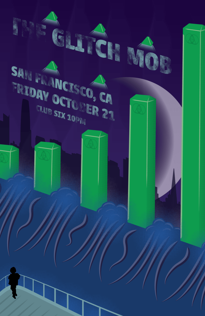
This is a fictional poster for a real event. The Glitch Mob’s first album was called Drink the Sea, and that’s where the core idea for this image comes from: the ocean flowing over some kind of threshold. The pillars are reminiscent of an audio visualizer, and bear faint markings of the band’s logo, in front of a shadowy San Francisco skyline with a moon in a state similar to what it would be showing that night. The biggest challenge with this piece was maintaining perspective among the different elements.
Progress from color blocking to initial draft and then revisions.


Tools used: Illustrator, Krita, Photoshop

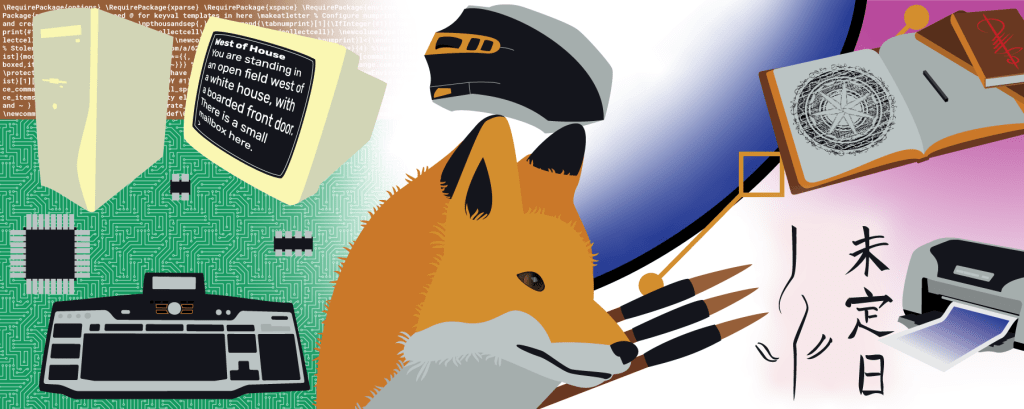
The goal here was to tell a story about my life, so I attempted to show the gradual evolution of myself from being more tech and game focused to being more artistic and design-focused. The fox in the center is to represent myself, looking towards the future.
Tools Used: Illustrator, Krita

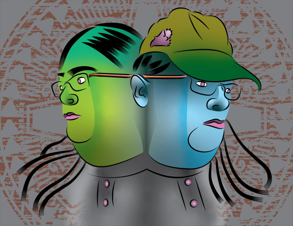
This is an abstract self-portrait. The color palette was chosen to represent anxiety; the greens represent feelings of fear and the blues freezing up. The dim clock-like background mandala represents time marching on regardless. The most challenging part of this project was the hair, it was hard to find a good way to represent it with a combination of simplicity and veracity.
Tools Used: Illustrator

When care workers are hired, agencies want to efficently background screen them so they can fill positions that work with the people that they are responsible for.
Mariana is an administrator at a foster care agency in Northern California. She manages dozens of hirings per month for positions that need to be screened because they deal directly with California youth. For this, she has to enter them into the Community Care Licensing software called Guardian which manages the screening process both for agency users like her and the CCL staff that do the screening. She’s often frustrated at how long it takes for CCL to get back to her when she has questions about an applicant. Many screenings clear in a week or so, but some can take as long as 120 days to process, and those often require multiple phone calls or emails just to find out what’s going on.

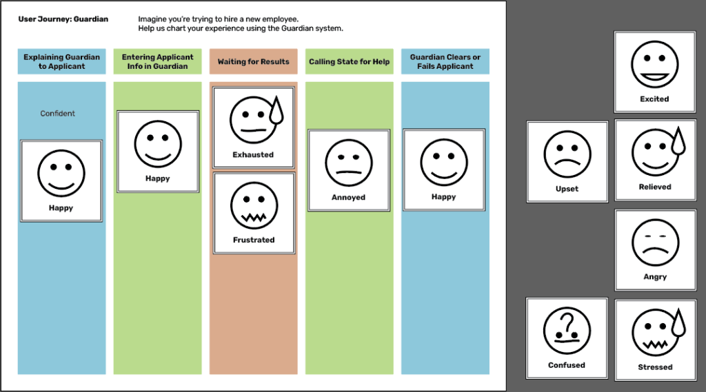
I used an empathy probe with several end users of Guardian who order CCL background screenings regularly. This interaction allowed me to gain an understanding of their thoughts and feelings about their challenges with Guardian.
Themes: TIME and RESPONSIVENESS
How might we support agencies in learning how to use and understand the Guardian software.
As we can’t change the Guardian software or add much more to their staff workload, we had to think outside the box on this one. When we settled on this as a direction, we quickly came up with a number of concepts, including
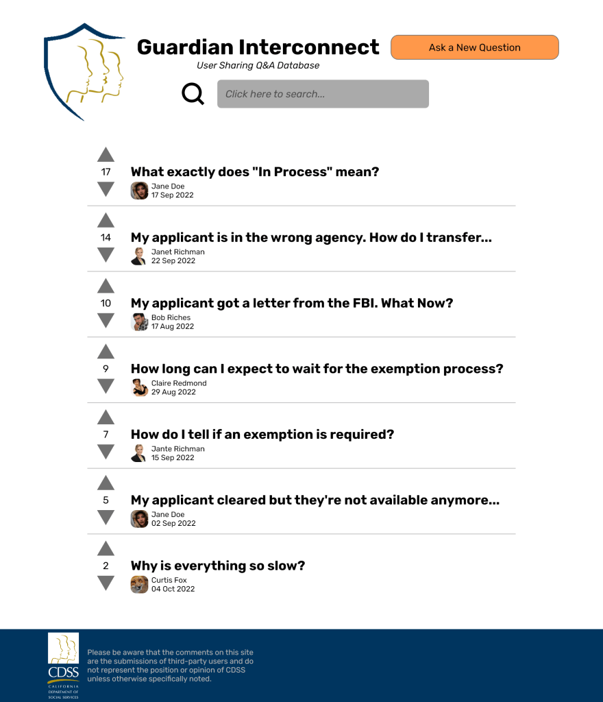
GUARDIAN INTERCONNECT
This is a forum where users can ask questions and receive answers from other users. Users can vote questions and answers up or down, and the aggregate score will place them in the order of most useful to least useful.
Readers familiar with Reddit or Stack Exchange may recognize this style of voting metric, as it’s an underpinning feature of both of those sites.

We took this prototype to the users we had interviewed before and got positive responses. The biggest concern was one of legitimacy; one user wanted to know if it was clear that the answers were not provided by CCL itself and rather by other users like them. To aid in making this distinction clear, I added a disclaimer to the final version and changed the branding a little to make it clear what kind of resource it is. There were also some concerns over trolling and inappropriate answers that can be addressed with a report-to-administrator button.
These are all of the example pages of the final prototype:


Farmers’ markets might seem like a simple affair, but once you dig under the surface you start to find a number of problems and inefficiencies. In my case, what I found was a lack of consistent messaging. It wasn’t easy for customers to find the vendors with the products they were looking for. Even when those vendors were known, it could take a lot of time and a lot of energy to check all the prices—and those prices are likely to change as the day wears on.
How might we help farmers’ market customers find the best vendors for their needs?
After investigating the market for insights and going through a few rounds of sketched ideas, I’d settled on an innovation to help with this problem: an app that could guide people through a market, highlighting deals and showing exactly where products they desired and their favorite vendors were located. It would need to crowdsource its data, of course, I’d learned that the vendors at the markets were far too busy to do much of that on their own.
This is what the prototype looked like in the field. A simple cardboard backing holding a set of cards representing the screens of the app, held together by a 2-inch binder ring. Simple, straightforward, and easy to make. This is what I put into the hands of customers at the market.

Here’s the entire original set of cards from the prototype laid out side by side.

So I took this prototype out into the field at another farmers’ market and got some interesting feedback from the customers there.
After receiving this feedback, I made an updated version of the prototype incorporating some of the suggestions and attempting to make sure it would work for everyone.

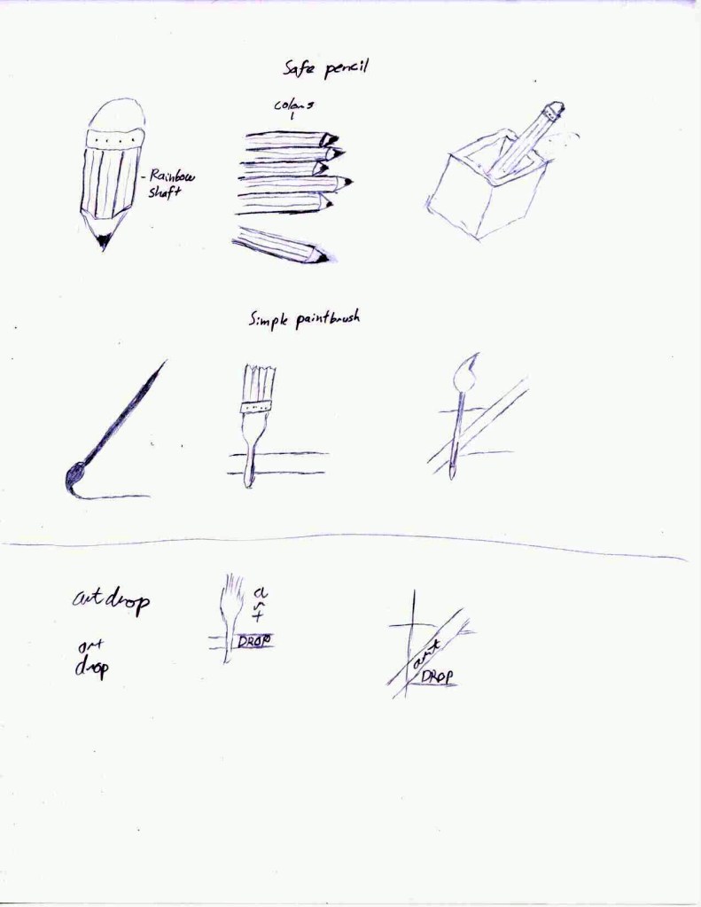
So you’ve already seen this at the top of the webpage, I’m sure. There’s a little bit of a story behind this symbol, though. Sometime in 2019, I woke up with a fleeting idea of shape in my mind. I went to what I was using at the time, Inkscape, and tried to work out what was in my head.
Well, that was my first attempt. I didn’t like it very much, though there were certain attributes of motion about it that felt right. I kept at it, and eventually ended up with this.
This symbol has stuck with me ever since. I tried to recreate it with a calligraphy brush a few times over the years. It was a challenge to achieve something resembling the proper balance and flow.
So when I needed to sketch out ideas for a new logo as a class project, I happened to look at one of the calligraphic attempts that was still hanging by my workstation. That lead me to sketch it out as a contender.
When it came time to create a digital logo, I chose this one to enlarge and trace, adding the small flourishes of line weight and trailing strokes to indicate a calligraphic approach. I made sure to take care to maintain consistent lines and spacing between the points, making guides and taking measurements to help me consider the balance of the piece.
I chose the red of stamped names and seal wax. I added to the perimeter circle a series of petals to indicate an opening portal and suggest forward motion. I have since discovered that the rim can be read as a gear, but that serves my purposes well enough too.
The sigil can stand without the circle, of course, and can live in many colors. As a final example, here is a more lucent version I created in friendly colors as a phone background.
Tools Used: Inkscape, Illustrator, sumi brush

These three posters each implement the same story—“The Cab Ride I’ll Never Forget” by Kent Nerburn—in different ways, combining layout and image to pull out different feelings from the work. For this project, one of the posters was allowed to be illegible, hence the overlapping nature of the third installment.
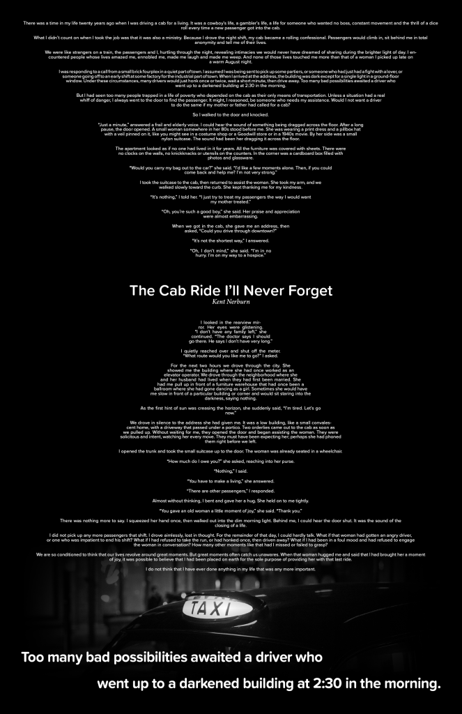
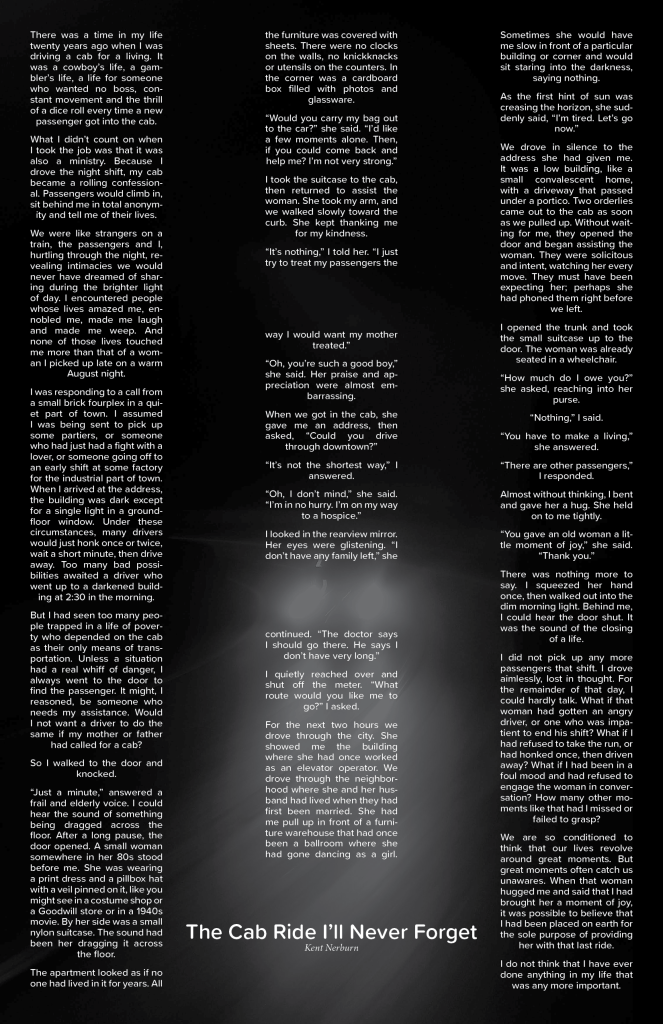
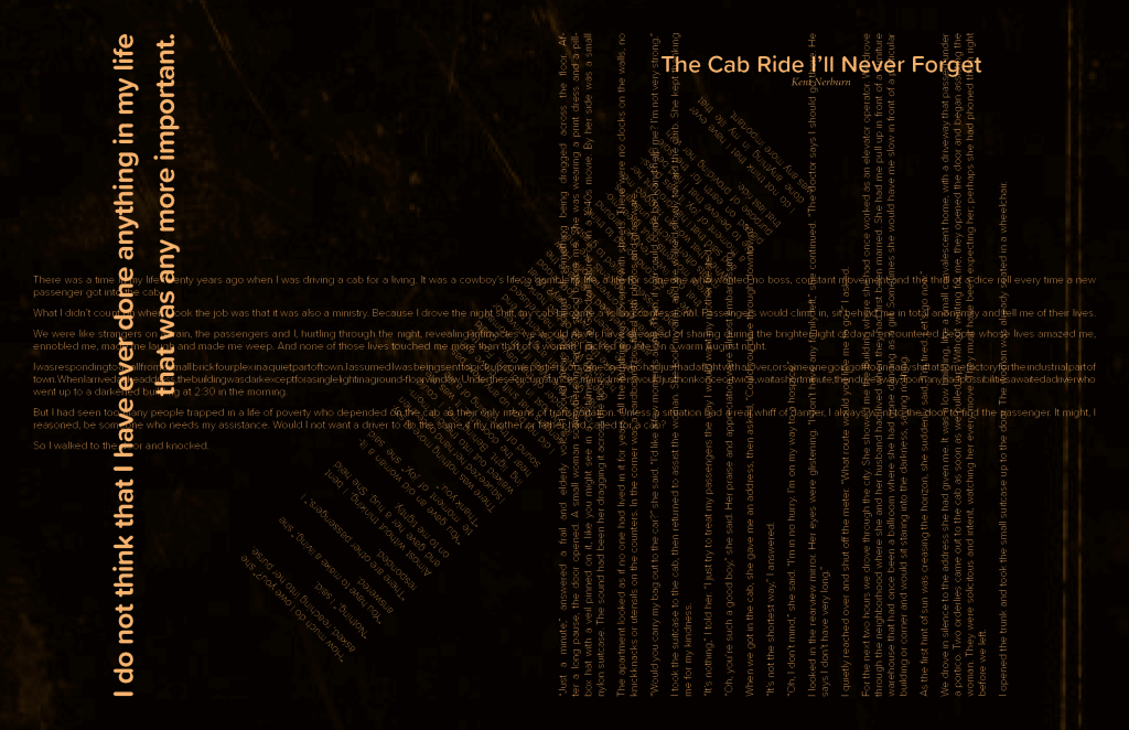
Tools used: InDesign

At Flagship Design Studio, our client Siskiyou County Arts Council needed a series of logos for various sub-projects they run. We began with combining words relevant to the project to create concept sketches and then moved on to combining ideas in vector form to create a campaign of logos in both color and black and white.


Tools Used: Illustrator, Artboard Studio

At Flagship Design Studio, our client Siskiyou County Arts Council was making plans to order swag to distribute at events or resell. This simple sheet shows the results of research into available swag items as well as providing mockups of potential items for the client.
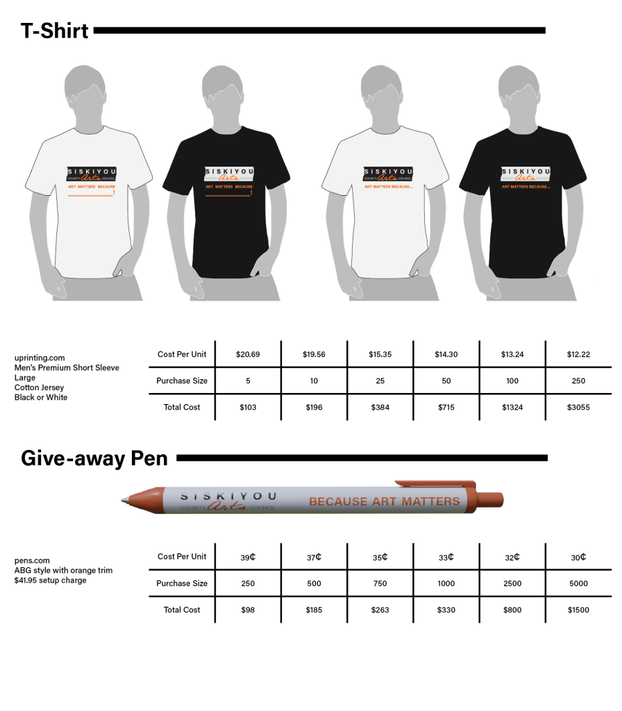
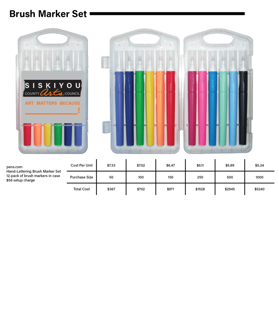
Tools Used: Illustrator
