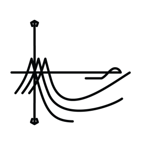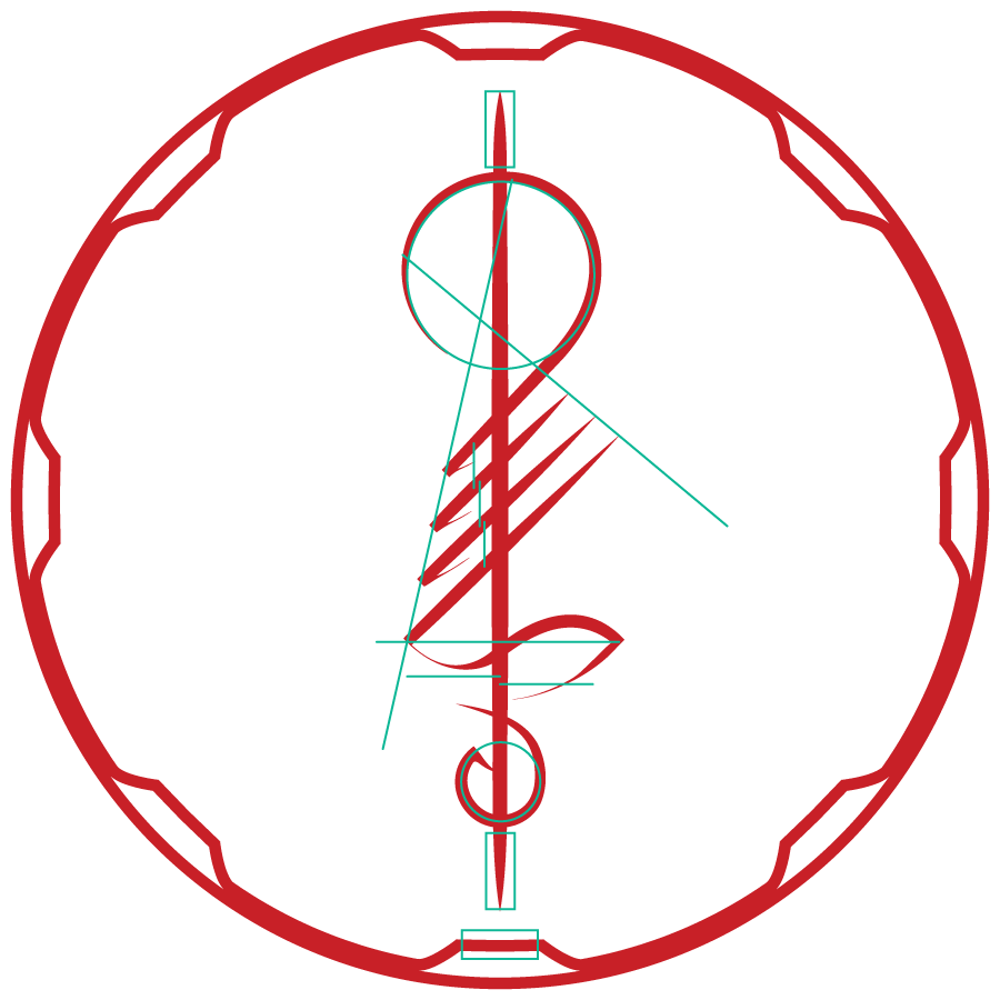
So you’ve already seen this at the top of the webpage, I’m sure. There’s a little bit of a story behind this symbol, though. Sometime in 2019, I woke up with a fleeting idea of shape in my mind. I went to what I was using at the time, Inkscape, and tried to work out what was in my head.

Well, that was my first attempt. I didn’t like it very much, though there were certain attributes of motion about it that felt right. I kept at it, and eventually ended up with this.

This symbol has stuck with me ever since. I tried to recreate it with a calligraphy brush a few times over the years. It was a challenge to achieve something resembling the proper balance and flow.


So when I needed to sketch out ideas for a new logo as a class project, I happened to look at one of the calligraphic attempts that was still hanging by my workstation. That lead me to sketch it out as a contender.

When it came time to create a digital logo, I chose this one to enlarge and trace, adding the small flourishes of line weight and trailing strokes to indicate a calligraphic approach. I made sure to take care to maintain consistent lines and spacing between the points, making guides and taking measurements to help me consider the balance of the piece.
I chose the red of stamped names and seal wax. I added to the perimeter circle a series of petals to indicate an opening portal and suggest forward motion. I have since discovered that the rim can be read as a gear, but that serves my purposes well enough too.

The sigil can stand without the circle, of course, and can live in many colors. As a final example, here is a more lucent version I created in friendly colors as a phone background.

Tools Used: Inkscape, Illustrator, sumi brush

