
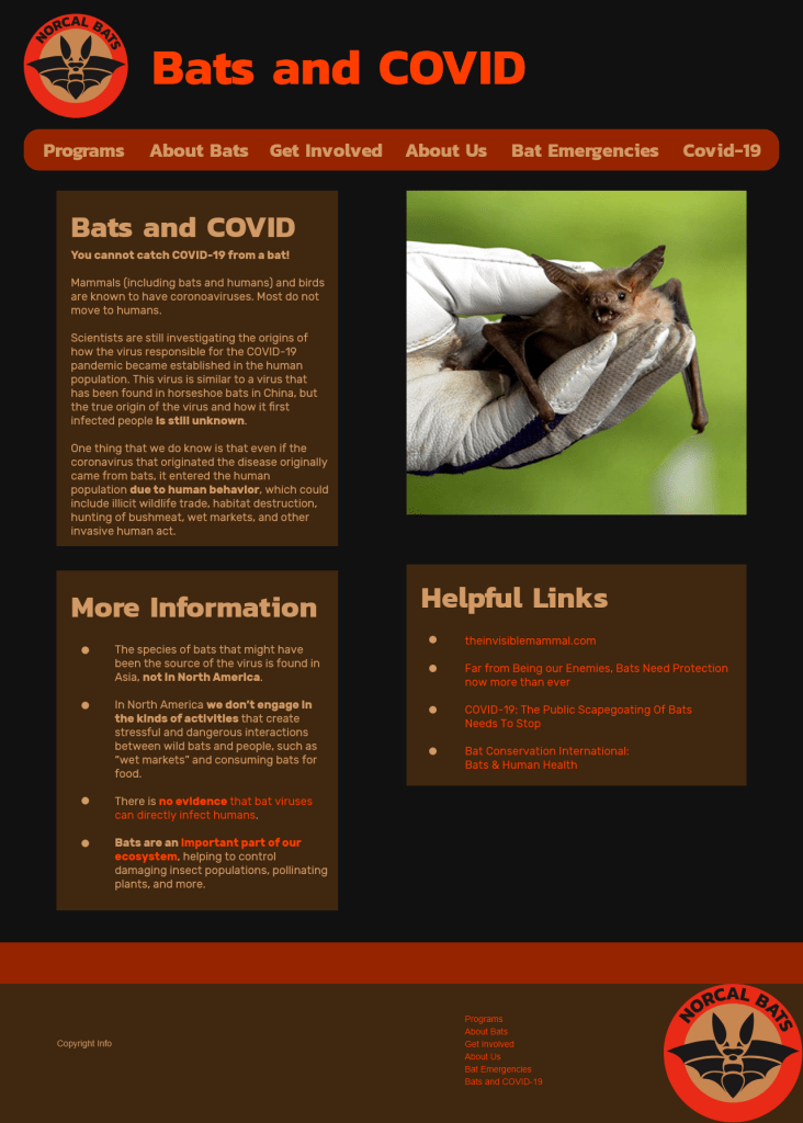
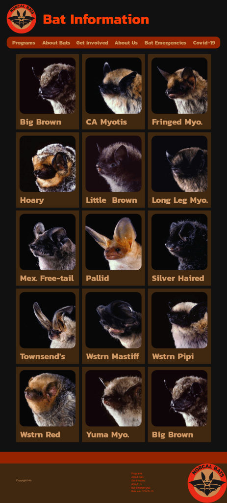
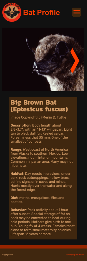
This redesign project was based on an actual website to be reimagined. It started with a design brief, user personas, a new information architecture, and a content inventory of the existing site. After that we created sketches and then wireframes on paper, then progressed through simple digital mockups to a final design for both mobile and desktop, reorganizing and modernizing the content to fit best practices. The final product consists of eight pages for both desktop and mobile, some of which are shown here, and videos demonstrating navigation through each version of the site.
Desktop Pages


Mobile Pages


Style tile showing the original logo.
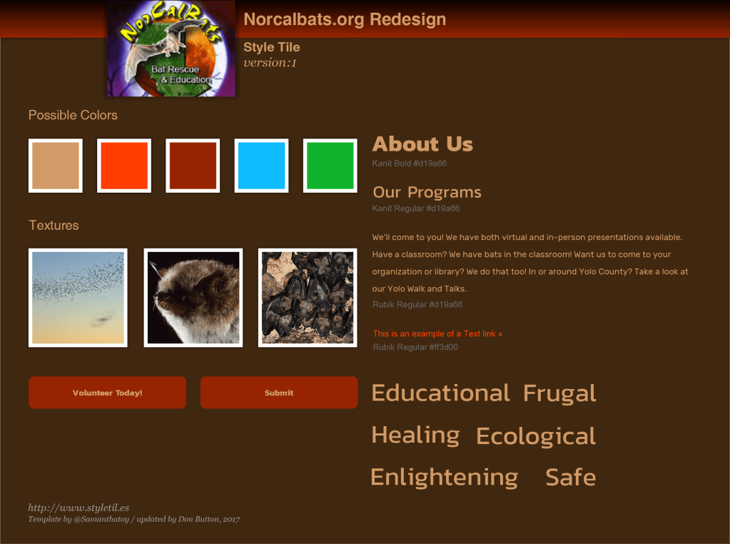
Tools used: Adobe XD, Illustrator
 Weaver’s Portfolio